Gestures and layout
This page describes the mobile layout in detail: how the screen reshapes at each size, the on-screen controls (mobile header, bottom navigation, folder drawer, action sheets), and the touch gestures (swipe, long-press) you use to work through your mail. For a high-level introduction and how the layout is chosen, see Mobile and tablet experience — overview.
This page describes the mobile layout in detail: how the screen reshapes at each size, the on-screen controls (mobile header, bottom navigation, folder drawer, action sheets), and the touch gestures (swipe, long-press) you use to work through your mail. For a high-level introduction and how the layout is chosen, see Mobile and tablet experience — overview.
Available in: Pro. Everything on this page is part of MailDesk Pro and appears only on the mobile (touch) layout. MailDesk Basic always uses the desktop layout.
Screen sizes and breakpoints
MailDesk Pro reshapes its layout progressively as the screen narrows. The widths below are the points at which the layout simplifies:
| Width | Device | What the layout does |
|---|---|---|
| up to 1280 px | small laptop / large tablet | Container spacing tightens; still multi-panel |
| up to 1024 px | tablet | Side panels stack rather than sit side by side |
| up to 820 px | tablet in portrait | Single-column layout |
| up to 480 px | phone | Full-screen surfaces, the bottom navigation bar, and a sticky reading view |
The full set of touch features — the mobile header, bottom navigation, swipe, long-press, and full-screen reading — applies on the phone layout. The choice between layouts is automatic and live, as described in the overview.
Touch targets are sized for fingers
On the mobile layout, buttons and rows are enlarged so they are comfortable to tap.
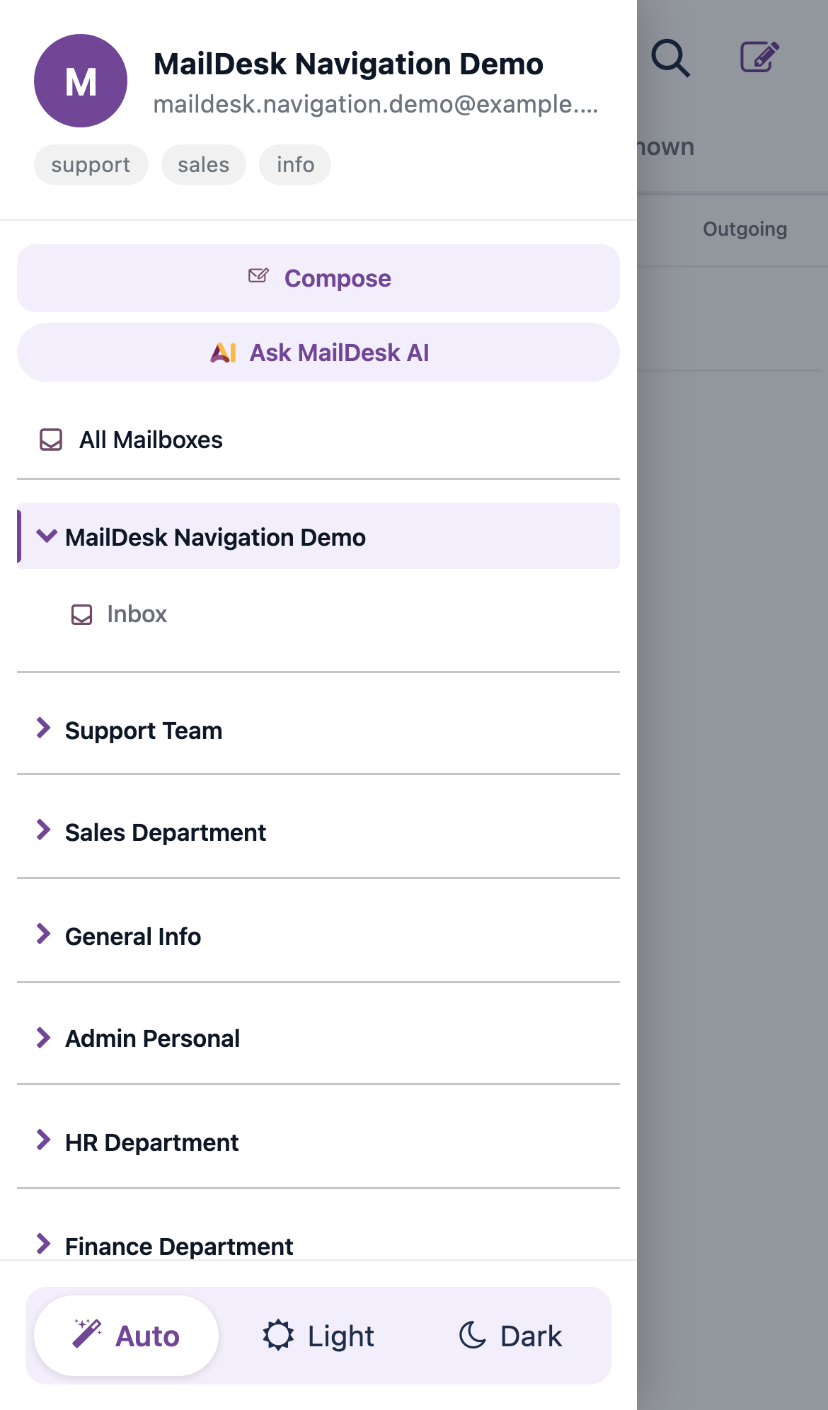
The mobile header
On a phone, MailDesk Pro replaces the desktop's top bar with a compact, branded header:
- A Folders button (the lines icon) on the left, which opens the folder drawer.
- The MailDesk logo and name in the centre.
- A Search button and a Compose (pencil) button on the right.
Below the bar, the header shows the current mailbox (an avatar initial and the email address) and any active filters as removable chips — for example a contact you filtered by, or a tag. Tap the small × on a chip to clear that filter directly from the list.
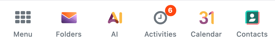
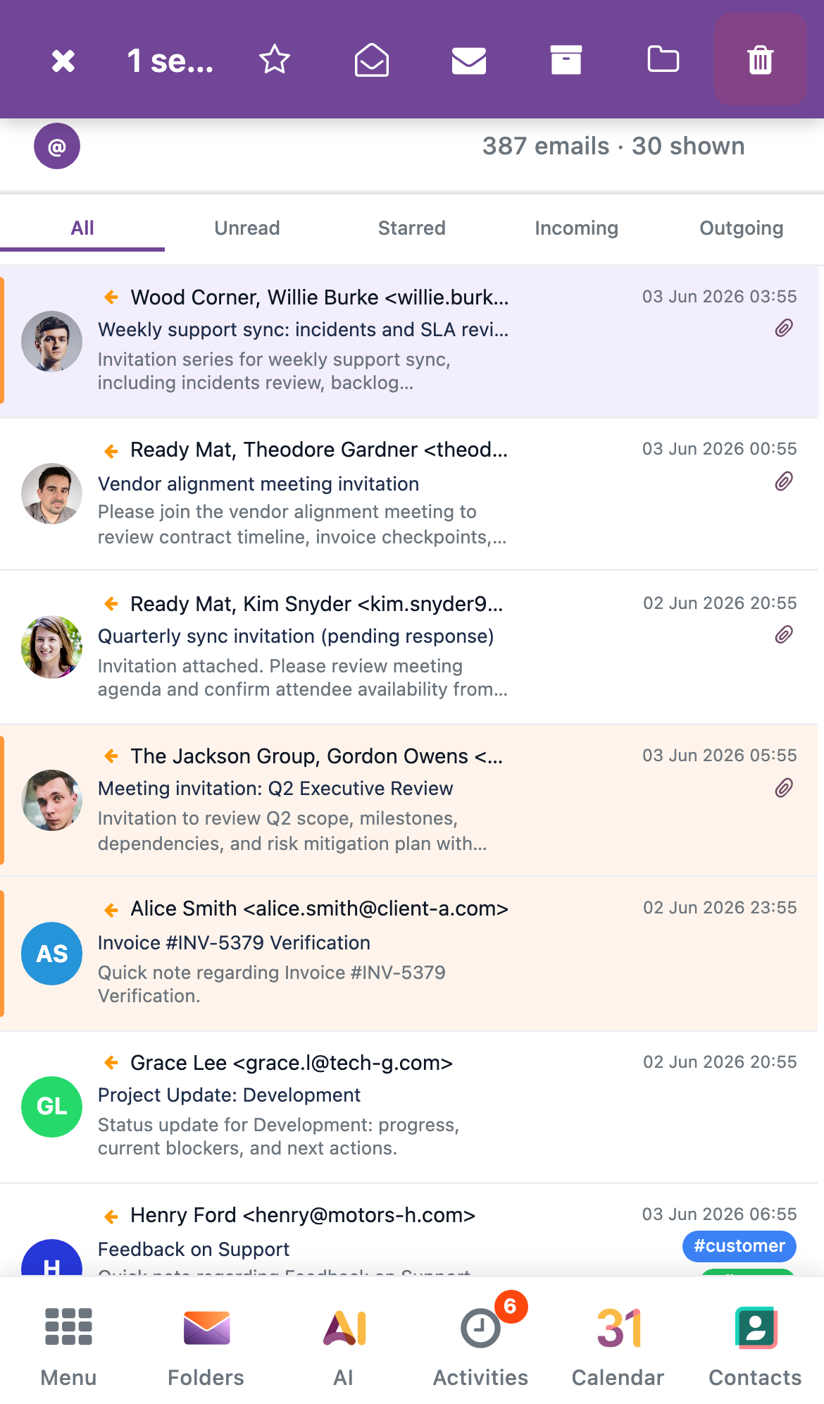
The bottom navigation bar
A bar fixed to the bottom of the screen lets you move between the main parts of MailDesk with your thumb. Its buttons are:
- Menu — opens the standard Odoo apps menu (the top bar is hidden on phones, so this brings it within reach).
- Folders — opens the folder drawer (the same drawer the header's folders button opens).
- AI — opens the MailDesk Pro AI actions in an action sheet.
- Activities — opens your activities.
- Calendar — opens the Calendar app (shown only when Calendar is installed).
- Contacts — opens the Contacts app (shown only when Contacts is installed).
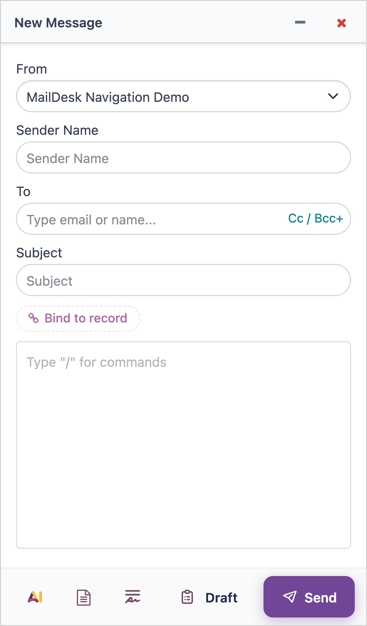
Compose lives in the header
On the mobile layout, you start a new email from the Compose (pencil) button in the header, or from the Odoo menu. There is no separate floating compose button on the list.
The folder drawer
On a phone the folder list is not always on screen. Open it as a drawer that slides in from the left — from the Folders button in the header or the Folders button in the bottom bar. A dimmed backdrop covers the rest of the screen while the drawer is open.
The drawer shows the current mailbox (avatar, name, address) and any mailbox aliases at the top, your folder list in the middle, and the theme control (Auto / Light / Dark) at the bottom.
Close the drawer by tapping the backdrop or pressing Esc. While the drawer is open, keyboard focus stays inside it for accessibility.
Reading an email — the full-screen view
On a phone, tapping a message opens it as a full-screen view that slides in over the list.
- The view has a sticky header with a Back arrow (←) that returns you to the list, and the message subject.
- A compact action toolbar shows the primary actions — Reply, Reply All, and Forward (or Edit Draft for a draft) — plus a More button.
- Tapping More opens an action sheet with the remaining per-message actions.
To go back to the list, tap the Back arrow in the header.
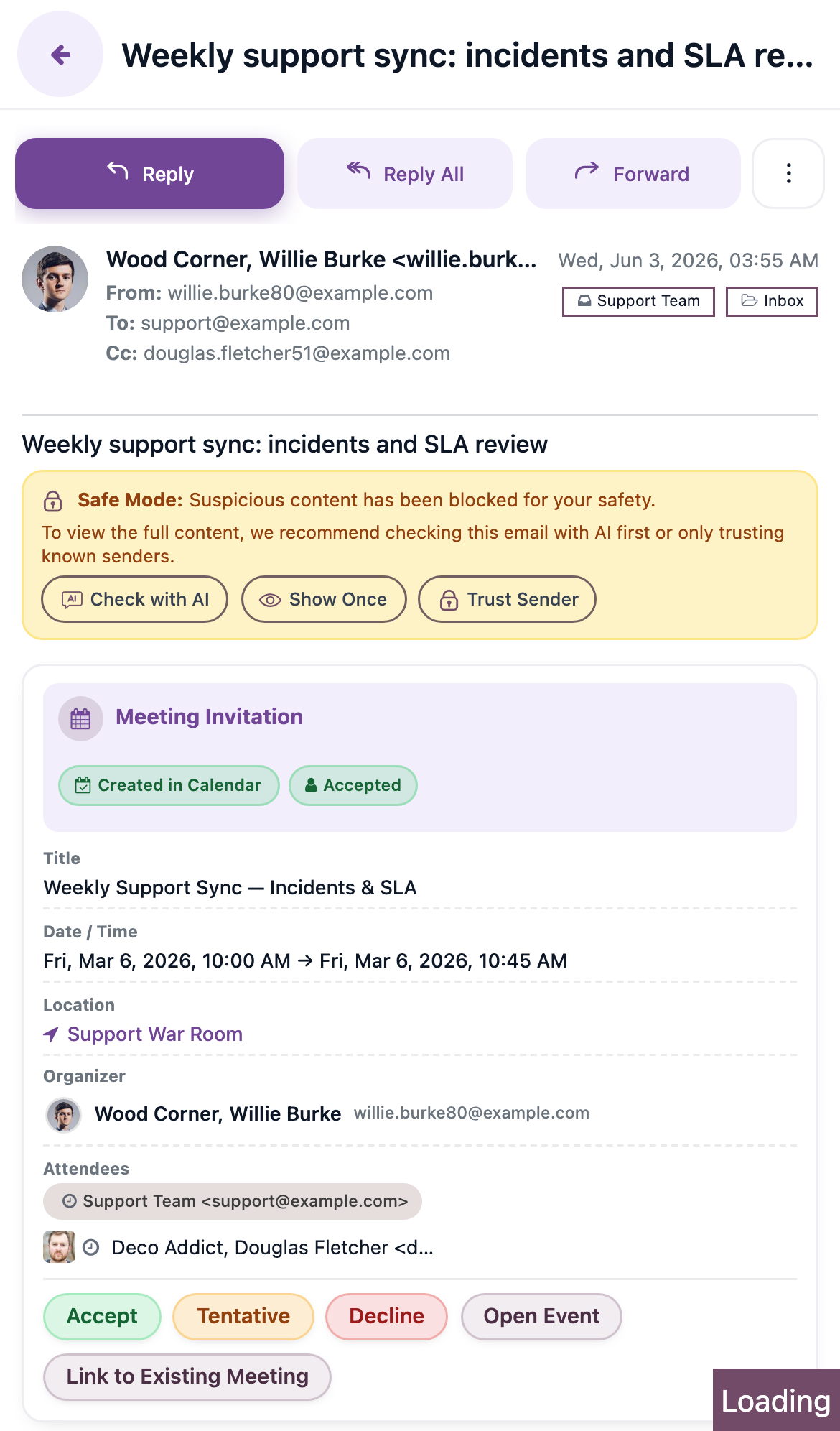
A message's attachments are listed inline beneath the body, each with its own download control, so you can open or save a file without leaving the reading view.
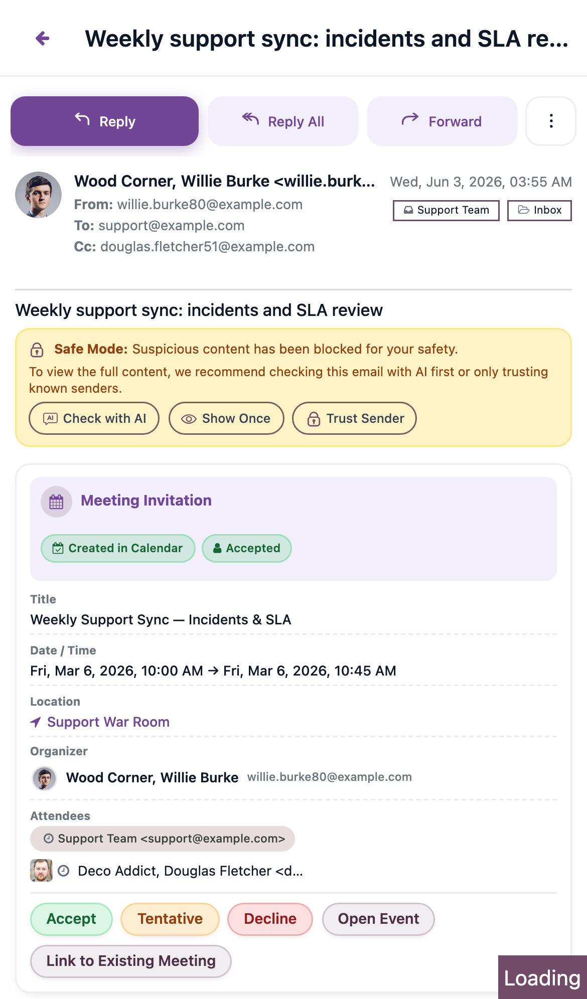
Per-message action sheets
Per-message actions appear in a sheet that slides up from the bottom of the screen. You reach it from the More button while reading a message. The sheet lists actions such as reply, star, move, tags, link, and delete, each as a large, easy-to-tap row. Tap the backdrop or the close button to dismiss it.
The same sheet pattern is used for the Pro pickers (such as linking an email to an Odoo record, or choosing a signature or template): on a phone they appear as a bottom sheet rather than a centred dialog.
Gestures
Swipe a message to archive or delete
Swipe a message row horizontally to act on it without opening it:
- Swipe right → Archive.
- Swipe left → Delete.
A swipe only counts when it travels far enough and fast enough, so an accidental nudge does nothing. If you start scrolling the list vertically instead, MailDesk lets the scroll happen and ignores the swipe.
The two actions behave differently:
- Delete uses the same safe, reversible flow as the rest of MailDesk: the message is removed from the list immediately and you get a brief chance to undo before it is finalised.
- Archive moves the message to the Archive folder straight away. There is no undo step — to bring it back, open the Archive folder and move it out again.
Press and hold to select several messages
To act on more than one message at once, press and hold a message for a moment. That message becomes selected and a selection toolbar appears. Then tap other messages to add them to the selection. Tapping a selected message again removes it.
The selection toolbar offers: exit selection (×), star, mark as read, mark as unread, archive, move to folder, and delete.
A short buzz confirms the selection
On devices that support it, a brief vibration confirms when press-and-hold starts the selection. On devices or browsers without vibration support, nothing happens — the selection still works.
Expected result
On a phone, you can run your whole inbox by thumb: open the folder drawer from the header or the bottom bar, read a message full-screen and return with the Back arrow, swipe to archive or delete, press and hold to select a batch, and reach AI, activities, and (when installed) Calendar and Contacts from the bottom navigation.
Troubleshooting
| Symptom | Likely cause | What to do |
|---|---|---|
| Swiping scrolls the list instead of archiving | The swipe was too slow or too short, or it drifted vertically | Swipe more deliberately and keep the motion horizontal |
| Press-and-hold does not start a selection | The finger moved before the hold completed | Hold without moving for a moment, then lift and tap to add more |
| No vibration when selecting | The device or browser does not expose vibration | This is expected; selection still works |
| Folder list is not visible | On a phone the folders are in the drawer | Tap Folders in the header or the bottom bar |
| Cannot find the compose button | Compose is in the header, not on the list | Tap the Compose (pencil) button in the header |
| The mobile layout is not showing at all | You are on Basic, or the window is wider than the phone threshold | See the overview troubleshooting |
Related
- Mobile and tablet experience — overview — what the mobile experience is and how the layout is chosen
- AI assistant — the Pro AI actions reachable from the bottom navigation AI button