Mobile and tablet experience — overview
Reading and triaging email on a phone with a layout built for a mouse is slow and fiddly. MailDesk Pro solves that for you automatically: the moment you open it on a phone or tablet, the same inbox you use at your desk reshapes itself into a clean, touch-first layout — a branded header, a navigation bar within thumb's reach, full-screen reading, swipe gestures, and an optional dark theme. Your mailboxes, folders, tags, and search are exactly as you left them. Only the way the
Reading and triaging email on a phone with a layout built for a mouse is slow and fiddly. MailDesk Pro solves that for you automatically: the moment you open it on a phone or tablet, the same inbox you use at your desk reshapes itself into a clean, touch-first layout — a branded header, a navigation bar within thumb's reach, full-screen reading, swipe gestures, and an optional dark theme. Your mailboxes, folders, tags, and search are exactly as you left them. Only the way the screen is arranged changes.
Available in: Pro. The adaptive mobile layer is part of MailDesk Pro. MailDesk Basic always uses the desktop layout, on every screen size.
Nothing to install, nothing to switch on
The mobile experience is built into Pro. There is no separate app to download, no setting an administrator has to enable, and no per-user preference to toggle. When you open MailDesk on a touch device, Pro recognises it and switches to the mobile layout for you — instantly, and only for that device.
Why you'll love it
- One product, every device. You never learn a second tool or carry a second app. The same mailboxes, folders, tags, threading, and search behave the same way — only the presentation adapts to the screen in your hand.
- Built for one thumb. Large touch targets, full-screen reading, and the actions you reach for most placed exactly where your thumb lands. Triaging a busy inbox on the train finally feels natural.
- Truly zero setup. Because detection is automatic, there is no rollout for an administrator to manage and nothing to explain to your team. It simply works the first time anyone opens MailDesk on a phone or tablet.
How MailDesk decides to use the mobile layout
MailDesk Pro chooses the layout for you — you never flip a switch. It looks at two simple signals:
- The kind of device. If the browser reports a touch screen without a precise pointer (a phone or tablet), MailDesk uses the mobile layout.
- The screen width. On a very narrow window (about 480 pixels wide or less) MailDesk also uses the mobile layout, even on a desktop — so a small browser window stays comfortable.
Otherwise MailDesk keeps the familiar desktop layout. Best of all, the choice is live: rotate a tablet or resize a window across that threshold and the layout switches at once, with no page reload and nothing lost.
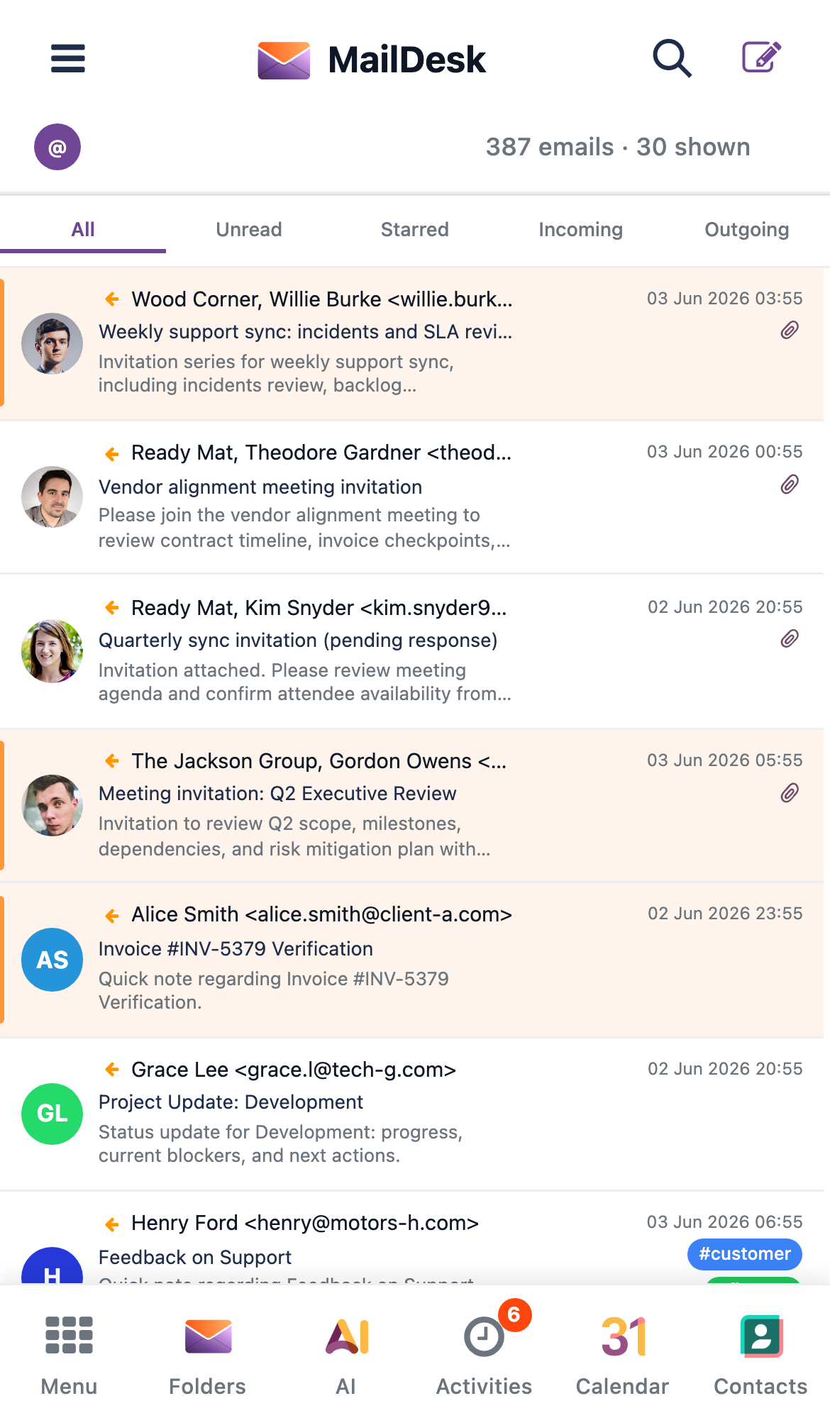
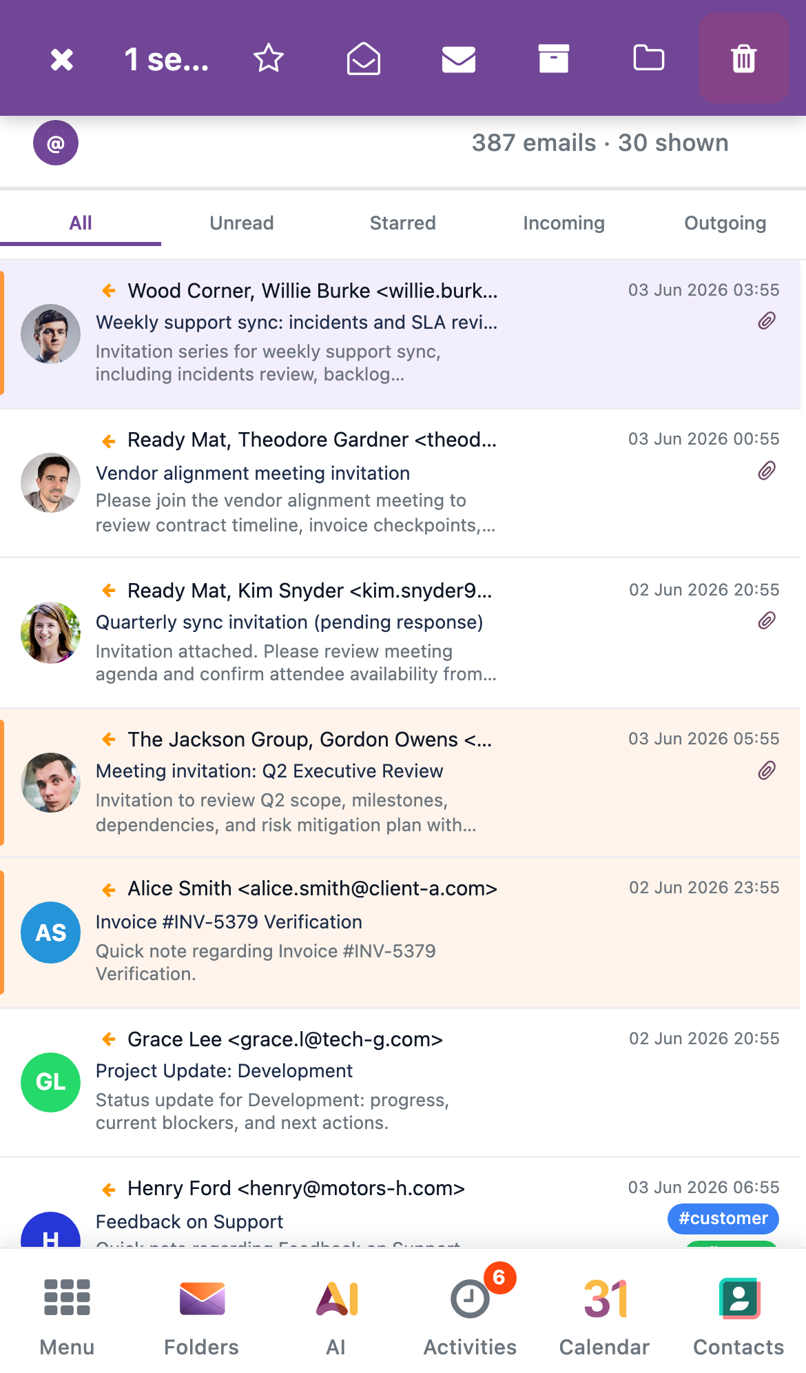
A tour of the mobile inbox
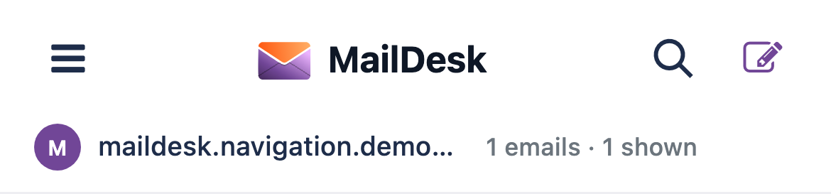
The branded header
At the top of every screen sits a MailDesk header that keeps the essentials one tap away.
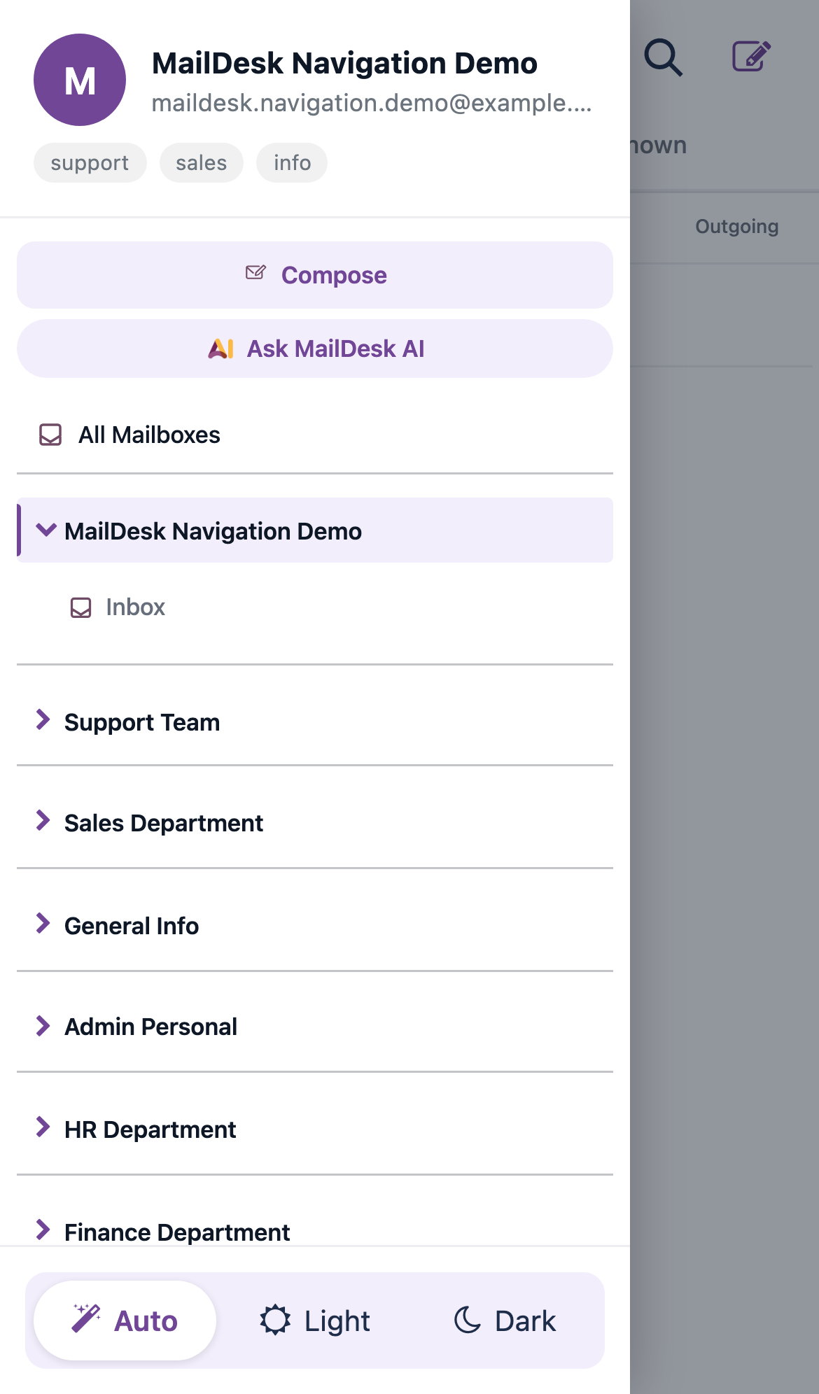
- A folders button (top left) that slides open your folders and accounts.
- The MailDesk logo and wordmark, so it always feels like home.
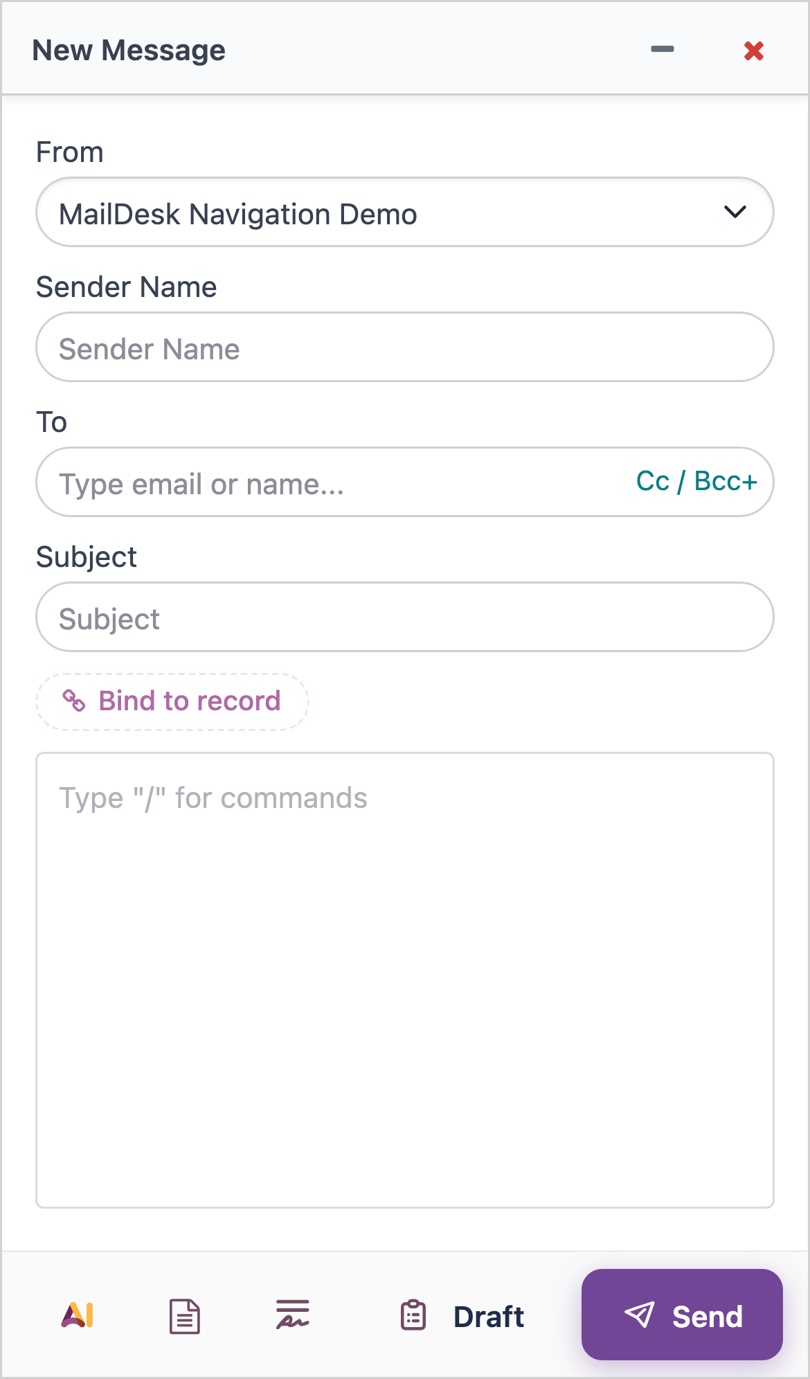
- A compose button (top right) to start a new email.
- An account chip showing the active mailbox, its avatar, and a badge with your total unread count — so you always know which inbox you're in.
- A search icon that reveals the search box only when you want it, so it never wastes space while you read.
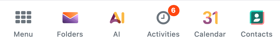
The bottom navigation bar
The most-used destinations live in a fixed bar across the bottom of the screen, right where your thumb rests:
- Menu — opens the standard Odoo apps grid, so you can jump to any other app without a top bar.
- Folders — opens your folders and accounts drawer.
- AI — a prominent, raised button that opens the MailDesk AI assistant (Pro).
- Activities — your "My Activities" list, with a badge for anything pending.
- Calendar and Contacts — added automatically when those Odoo apps are installed, so they appear only if you actually use them.
The Email tab also carries a badge with your unread total, so a glance tells you whether there's new mail to see.
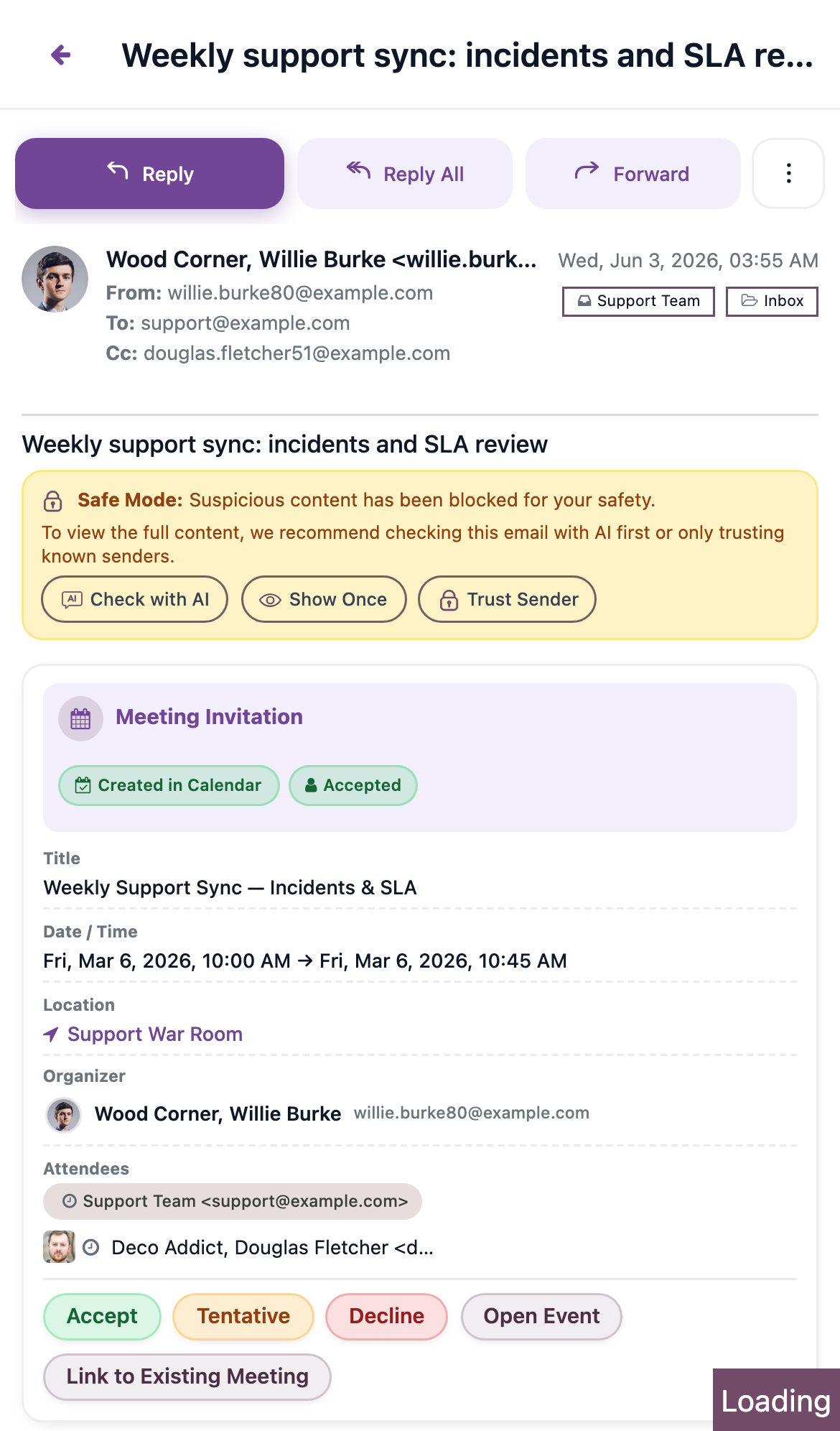
Full-screen reading
Tap any message and it slides in over the list to fill the whole screen — no cramped side panel. Everything you expect is there: the full conversation, the reply and forward toolbar, attachments, and the AI tools. A clear Back (←) button returns you to the list whenever you're done.
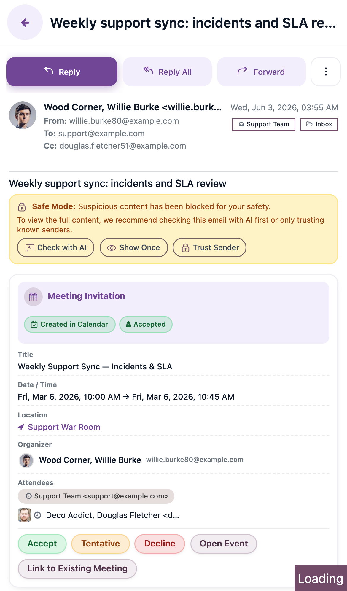
Attachments open the same way they do on the desktop — tap to preview or download a file straight from the message.
The folders drawer
Tap Folders in the header or the bottom bar and your folders and accounts slide in from the side. Pick a folder, switch accounts, and the list updates — then the drawer steps out of your way.

The drawer also holds the theme control for light and dark reading — see below.
Touch gestures that feel right
MailDesk Pro brings the gestures you already know from your phone into your inbox.
- Swipe to file. Swipe a message to the right to archive it, or to the left to delete it — with the same optimistic update and undo you get on the desktop, so a mistaken swipe is always reversible.
- Press and hold to select. Long-press any message to enter selection mode, then tap others to add them. A bulk action bar appears so you can archive, delete, mark read or unread, star, or move several messages at once.
- Per-message action sheet. Need more than the toolbar offers? A bottom sheet brings up the full set of actions for a single message — reply, forward, mark read or unread, star, delete, link to an Odoo record, and ask the AI about it.
Dark theme for comfortable reading
On phones and tablets you can switch MailDesk Pro to a dark theme for easier reading in low light. The control lives in the folders drawer and offers three choices — Auto, Light, and Dark. Auto follows your Odoo appearance; choose Dark explicitly when you want a darker screen at night.
Dark theme is for the mobile layout
The dark theme applies to the mobile (touch) layout. The desktop layout keeps its standard light appearance.
What changes — at a glance
On a phone, the desktop's side-by-side panels become a single, focused column. Everything is still there; it's simply arranged for touch.
| On the desktop | On a phone (Pro) |
|---|---|
| Folder list always visible on the left | Folders open in a slide-in drawer, reached from the header or the bottom bar |
| Message list and reading pane side by side | The list fills the screen; opening a message slides it in full-screen |
| Full toolbar above each message | A compact reply toolbar, with the rest in a per-message action sheet |
| Right-click menu for per-message actions | Swipe a message, or open its action sheet |
| Multi-select with checkboxes | Press and hold to start selecting, then tap others |
| Light theme | Optional dark theme for low-light reading |
On a tablet the layout sits between the desktop and the phone. As the screen narrows the panels progressively simplify — a wide tablet keeps more on screen, while a tablet held in portrait collapses toward the single-column phone layout.
What you can expect
Open MailDesk Pro on a phone and you'll see the branded MailDesk header, your inbox as a single full-width list, and a navigation bar across the bottom. Tap a message and it opens full-screen with a Back arrow to return. Swipe to archive or delete, long-press to select several at once, and flip to dark theme when the light fades. Everything you do at your desk — read, reply, file, tag, search, link to a record, ask the AI — travels with you, arranged for your thumb.
Requirements
- MailDesk Pro installed and active. (MailDesk Basic does not include the adaptive layout.)
- A modern, up-to-date mobile browser. The layout uses standard touch and pointer events that every current mobile browser supports.
- MailDesk works on Odoo 17, 18, or 19 — the adaptive layout behaves the same on each.
Permissions
The mobile experience needs no special permissions. Anyone who can open MailDesk sees the layout that matches their device, and you only ever see the mailboxes and folders you already have access to — the mobile layout never changes who can see what.
If the layout doesn't look right
| What you see | Likely cause | What to do |
|---|---|---|
| The desktop layout on a phone | You're running MailDesk Basic — the adaptive layout is a Pro feature | Confirm MailDesk Pro is installed and active |
| The desktop layout on a tablet | The browser reports a precise pointer, so MailDesk treats it as a desktop | Use the device in touch mode, or narrow the window below the phone threshold |
| The mobile layout on a small desktop window | The window is narrower than the phone threshold | Widen the window past the phone threshold |
| The layout doesn't switch when you rotate | The tab needs to recompute the size | Keep the tab in the foreground; the layout re-checks on rotation and resize |
Related
- AI assistant — the Pro AI features reachable from the mobile AI button
- Realtime & synchronization architecture — how new mail arrives
- Licensing & tiers